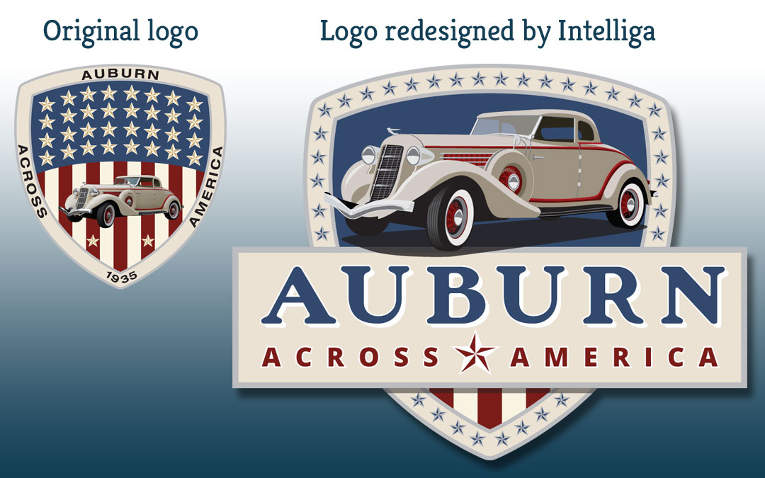
As part of our recent redesign of the Auburn Across America web site, Intelliga recommended a logo refresh.
Let’s face it… the old logo was not only just “meh”, but it wasn’t well suited to inclusion on a web site – it either needed to be too big in order to be legible, or it was impossible to read.
The original solution? Double it up and repeat the name again?! That’s just lazy.

An update seemed obvious: retain many of the elements, but organize and integrate those elements better!
First and foremost, a font change: we looked for a font that would reflect the qualities of the original Auburn logo! And it had to be legible, so we introduced a simple container for the name.
Second, retain the primary shape and American feel of the original logo for the sake on continuity, the car – an obvious choice, and 34 stars to represent the 34 American cities sharing the “Auburn” name that are the destinations on the “Auburn Across America” journey!
The biggest challenge of the redesign was to recreate the Auburn car image as an illustration rather than the cut-out photo from the original logo.
We’re pleased with the results, as is the client.
Can we help YOU with logo and branding work? Get in touch! Contact us.


